Fielders
Research / Strategy / Value Proposition / Branding

Keeping BlueScope’s ‘Fielders’ brand strong

Challenge

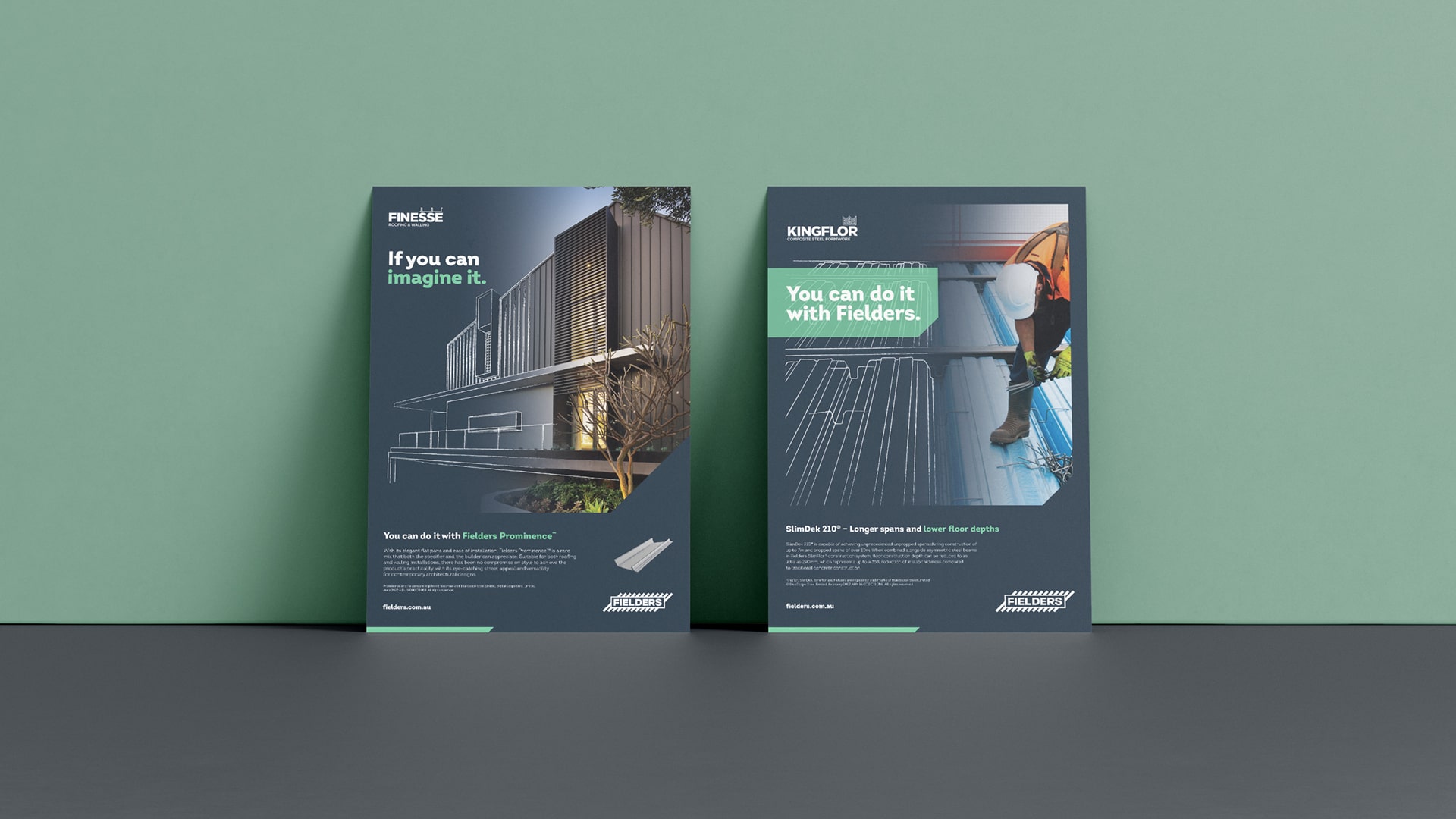
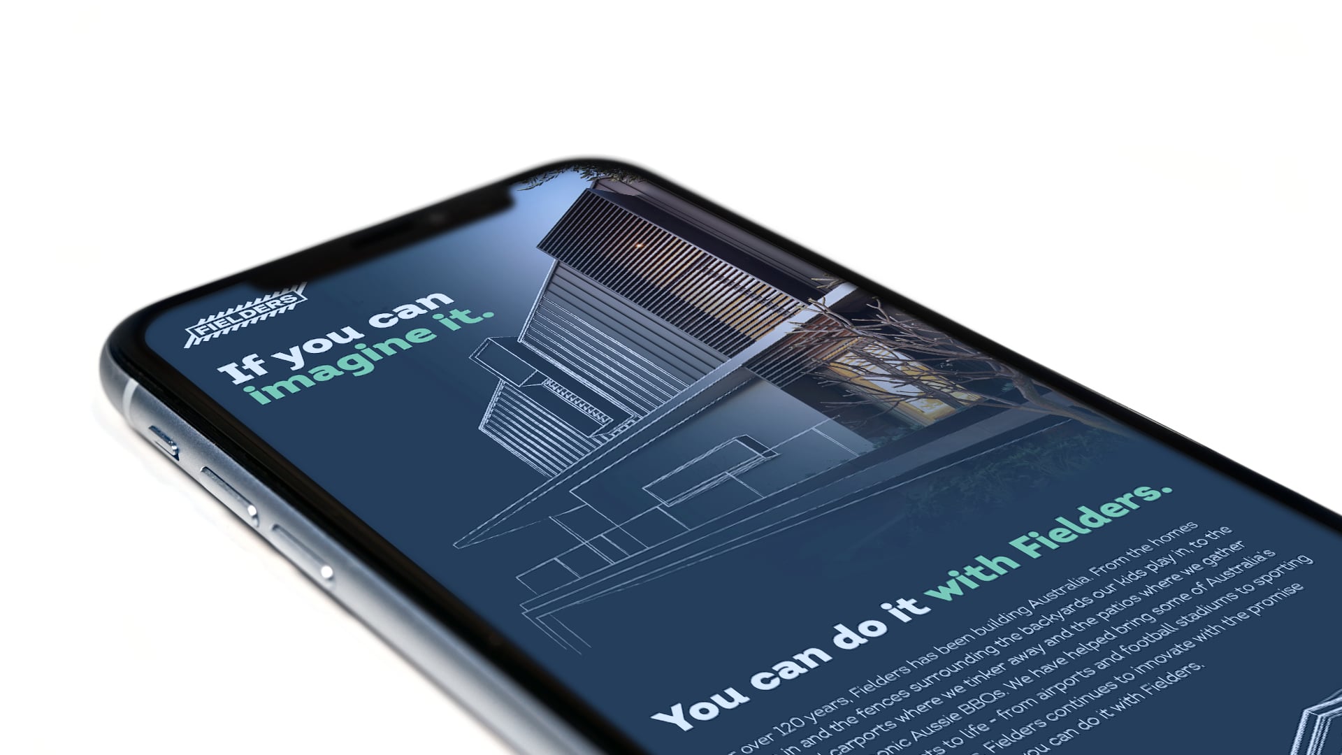
What happens when one of South and Western Australia’s most respected steel construction brands is acquired by an equally prominent east coast company, but one with a lower profile in southern and western markets?

This was the situation affecting Fielders several years ago, and while there may have been a temptation to consolidate the two, such was Fielders’ strength in its local markets that new parent company, BlueScope, decide to maintain Fielders as a standalone brand.

However, it did seek to better understand Fielders’ positioning within the market, as well as its customer journey, so it could refresh and further progress the brand.

Fielders example of branding, showing colours and typography
Animated fielders logo
Fielders creative sketch image over roof product at airport
Our thinking

It was logical for BlueScope to keep the well-established Fielders brand, while refining its essence to better position it for ongoing growth.

Fielders began in South Australia over 120 years ago and was one of the first companies in Australia to rollform corrugated and v-crimp sheeting, so was extremely well entrenched within its markets.

Given Fielders’ prominence in SA and WA, it made sense to refine its positioning and brand essence rather than start from the beginning, which would have needed new brand equity to be built in those markets.

Fielders animation of sketch effect with words ' If you can image it, you can do it with Fielders'
Creative

I.M.A was engaged to assist Fielders to refine its brand essence and customer journey, ultimately developing a new positioning that highlighted Fielders’ solution-based approach to construction.

The accompanying activation statement, ‘You can do it with Fielders’, sought to instill the mindset that anything was possible with Fielders, both from a product perspective, and also by drawing on the brands’ expertise in providing customers with direction and to help them overcome technical hurdles.

To illustrate the concept of endless possibilities, a clever visual treatment was developed. The graphic shows the evolution of construction projects within the same illustration/image, beginning with architectural or engineering drawings, transitioning to renders and ultimately the real finished project.

Fielders sketch effect of product with heading 'If you can image it'
Fielders sketch effect of building
Fielders animation of product render and sketch effect
Fielders mockup of two flyers
Mockup of Fielders product email on mobile phone
Successes

Before bringing the new positioning to market, Fielders had begun an internal roll-out process to generate excitement.

I.M.A developed a suite of materials for Fielders team members, including a brand book, a brand video and other assets, and also introduced some fun elements as part of the staff engagement process.

One of these initiatives involved providing the team with Fielders branded Lego and asking them to make their own branches; they were also given new merchandise packs. Often employees are the last to receive gifts, so recognising their value and engaging them to participate in the new brand direction was important.

Along with these projects, I.M.A also modernised the Fielders logo, introducing a new colour palette and treatment. I.M.A will continue to assist Fielders with other activities as part of the brand identity refresh, including helping to further embed the brand strategy amongst existing and new employees.

What’s your unique B2B challenge?

We’re all ears, and we’re here to help you grow your business.